Choosing the Right Tile for Your Backsplash
Choosing a backsplash for your new or old kitchen isn’t always easy and can actually be quite overwhelming. Between the different material of tiles, the color, the shape, the orientation, and even the color of the grout one could get stuck in whirlpool of decision making. But luckily there are a few things that can help make the decision-making process not so daunting.
Bring Samples Home
The first thing I would advise is to bring samples of the tiles you like home because the tiles don’t always look the same as they do in the store. Every couple of days switch out the tile, this way you can really focus on each one individually, rather than always seeing them lined up next to each other. Also, make sure to switch up where you put the samples; one day you might have the tile leaning against the wall under the window where it looks great, but then when you put it in the corner you realize that it might be too dark. Other than changing the placement every once in a while, make sure to pay attention to how it looks in different lighting—morning, noon, night, overcast, sunny, etc. Lighting can seriously change the appearance of a tile, especially if it has a lot of variation like marble, granite, and mosaic. But, lighting also relates to the lighting in your house. Do you have warm lighting or cool lighting? This is especially important if you’re choosing white tile or more neutral tile because if you have warm lighting in your house, the tile will look warmer and vice versa for cool lighting.
Expense
If you’re looking to install a backsplash than you know that it’s not necessarily the cheapest part of the renovation. However, recently there has been a lot of excitement over ceramic backsplashes because they not only look beautiful, but ceramic tile can also be considerably less expensive than some of the alternatives. Another idea would to not do tile at all and instead do a nice wallpaper, however, I’m not quite sure how wallpaper would hold up behind a sink or around the stove. If you really want tiles though, another option is glass, and while glass tile can be pretty pricey there are plenty of pocket-friendly options out there, it may just take a little digging.
Color, Shape, Size and Pattern
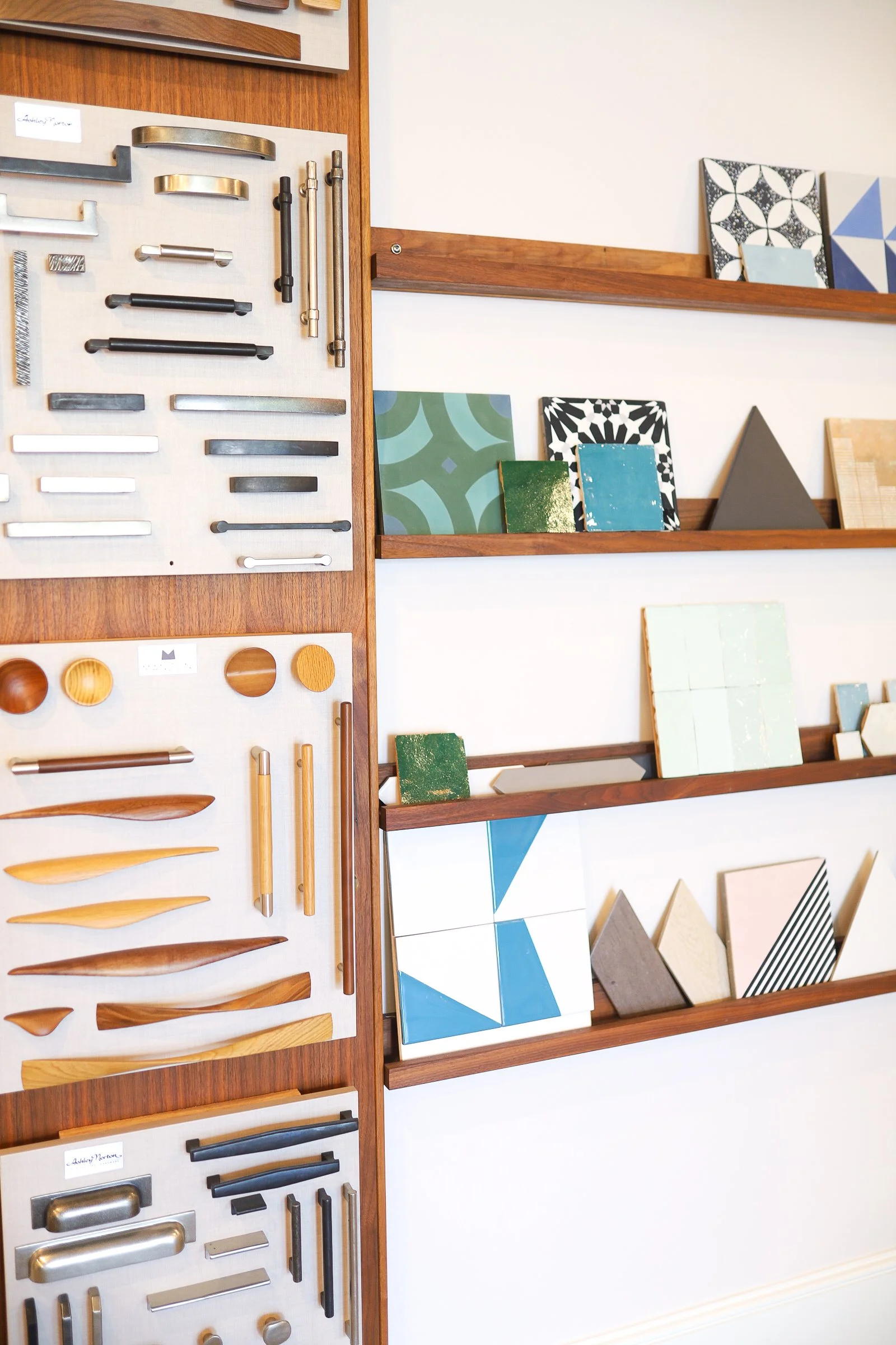
The color, shape, size, and pattern of your tile are ultimately up to you and what your preferences are. Some things to consider though when making these decisions is the lighting in your kitchen, the size of your kitchen, and the surrounding color pallet. The lighting in your kitchen has a big impact on how your tile will look like I mentioned before. If you get a lot of natural light, then I’d recommend tile that has a slight to a high gloss so that it catches the light and brightens up the kitchen without the need for interior lights. However, if you don’t get a lot of natural light then I would go for a more matte tile because matte tile doesn’t change as much with overhead lighting and the color of the tile will be truer to what you chose.
The size of your kitchen should also be a factor in your decision-making process. If you have a smaller kitchen, I’d stick with tiles that are lighter in color and bigger in size to help make your kitchen feel bigger. Sometimes darker tiles can make the room look smaller and smaller tiles can look too busy in a tight space. However, if you have a smaller kitchen that is pretty neutral in color, then you can definitely choose a tile that has a pattern or a variation, like a square painted ceramic tile, as long as they’re bigger.
The shape of the tile is really your preference. If you have low cabinets, using thin rectangle tiles going the long way up and down will make the space between the cabinets and the counter look bigger. But you could also achieve the same thing with long thin triangles or diamonds. When it comes to patterned tile, whether you get a sheet with different colored tiles or the tile itself has a pattern on it, it really boils down to the rest of your kitchen. If your kitchen has a lot going on—lots of jars and bowls on the counters, decorative cookware, etc.—a patterned tile may add to the busy-ness of your kitchen and make it feel cramped. However, I’ve seen beautiful kitchens full of trinkets and jars and decorative cookware that are super colorful and have a patterned backsplash and it doesn’t look too busy, so again it depends on what you like in a kitchen. Finally, the grout of the tile depends on whether you want high contrast or if you want the grout to blend in with the tile. Having grout that contrasts with the tile can make your tile pop more and add a little variation to the backsplash, so it doesn’t look too uniform. Using darker grout with lighter neutral colors can create a beautiful patterned backsplash that doesn’t require a lot of time or money. Additionally, darker grout is easier to keep looking clean because it hides a lot of buildups. Conversely, using grout that matches the tile will create a beautiful backsplash as well because it will make it look like one big slab rather than individual tiles.
I hope your decision-making process goes smoothly and your backsplash turns out just the way you want. Feel free to leave a comment if you have any questions or would like some ideas for your backsplash!

